Amazon Product Photos: 4 Photos That Increase Perceived Value
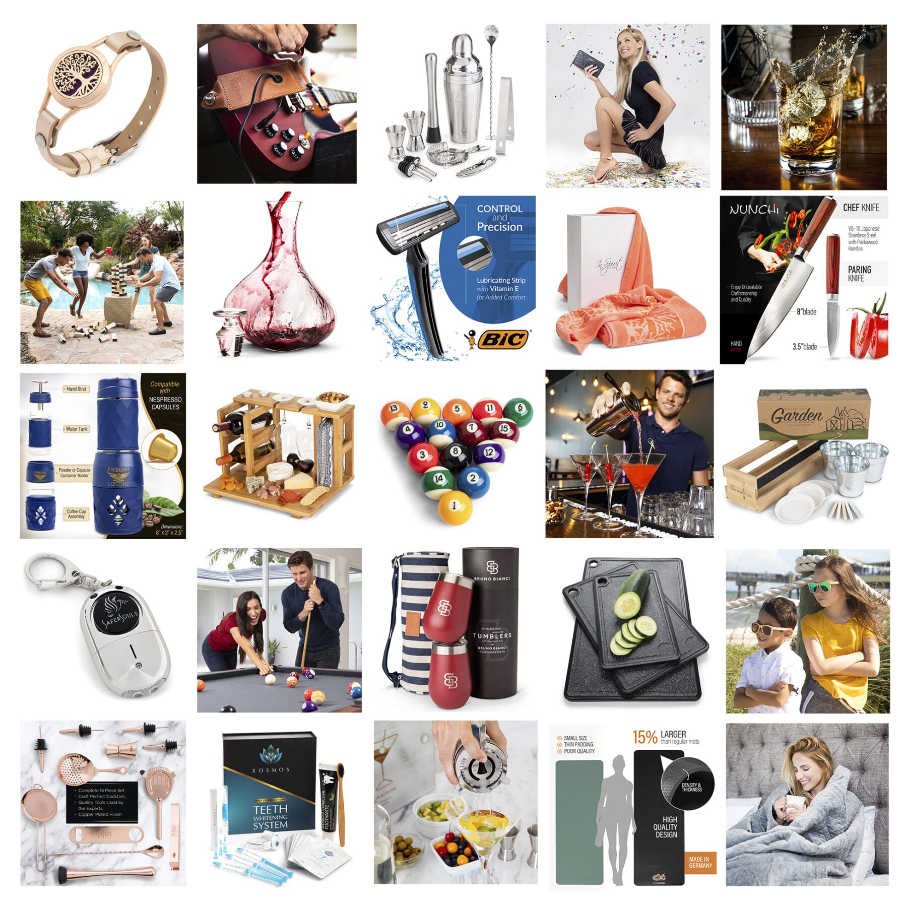
Your Amazon product photos bear a lot of the weight in determining whether a customer decides to buy from you.
For starters, compared to your product headline, product photos take up more visual real estate on Amazon’s search results page.
And the evidence is clear: Humans are primarily visual creatures. Half of the human brain is involved in processing visual information—both indirectly and directly.
So when someone looks through your product photos, you have a special opportunity to showcase your product in ways that send the message “this is your best option,” and actually have that message received.
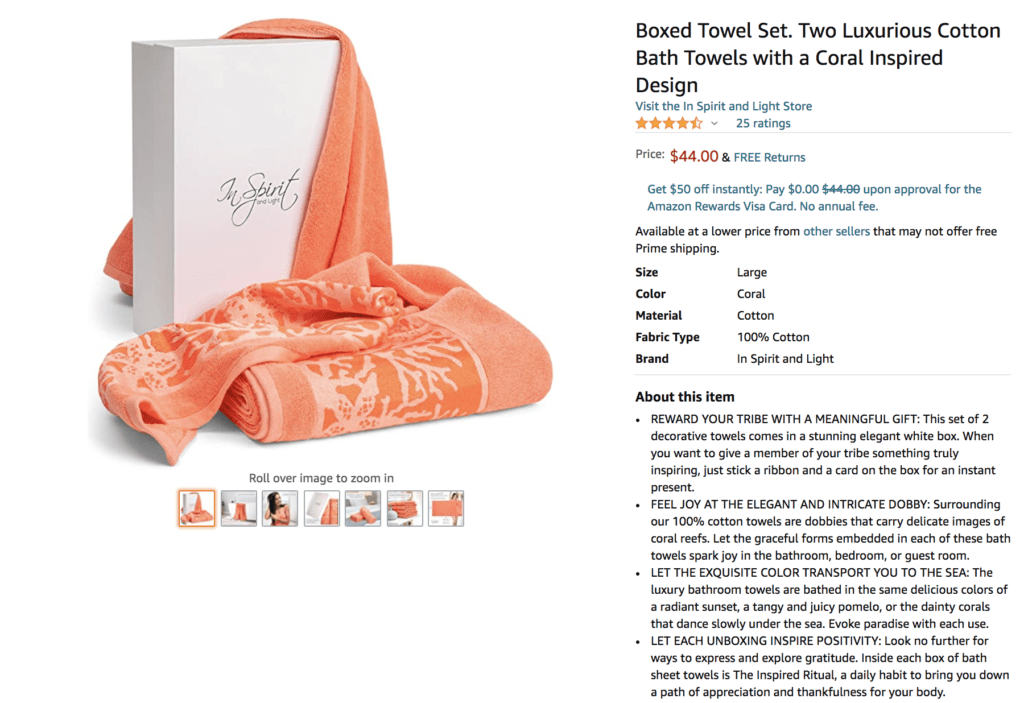
Now, when it comes to your main product photo—the photo customers see on the search results page—there’s only so much you can do. Amazon has a few requirements you must meet, otherwise, you risk having your listing shut down or suppressed.
The main requirements are pretty simple:
- Your product must be on a plain white background.
- Your product must take up 85% of the frame.
- The image should have no additional text or graphics.
Here’s an example:
While your main photo is incredibly important, Amazon’s restrictions make your job pretty simple.
But what about your other photos?
Well, Amazon allows you to upload nine images total, but generally, only six (excluding your main photo) will be displayed. So after your main image, you have six more photos you can add to your listing.
Those six photos should be selected strategically. And while it can feel difficult at first, it doesn’t have to be.
In this article, we’re going to cover four types of Amazon product photos that increase your product’s perceived value, and thus, increase your sales.
Amazon Product Photo Value Booster #1 – Let Me See It In Action
An object and a plain white background is just the beginning. After seeing what your product looks like, your customers want to see it in action.
If your product is a chair, then show someone sitting on the chair. If you want to highlight how portable your chair is, then show someone sitting on the chair in several places, for example, the beach, a concert, and camping.
Don’t leave the imagination process to your prospects. You don’t know what mind frame they’re in when they’re viewing your product. At the time they’re on your listing, they might be exhausted and in a rush to purchase something quick. Take the effort off their hands and remind them of why they need your product.
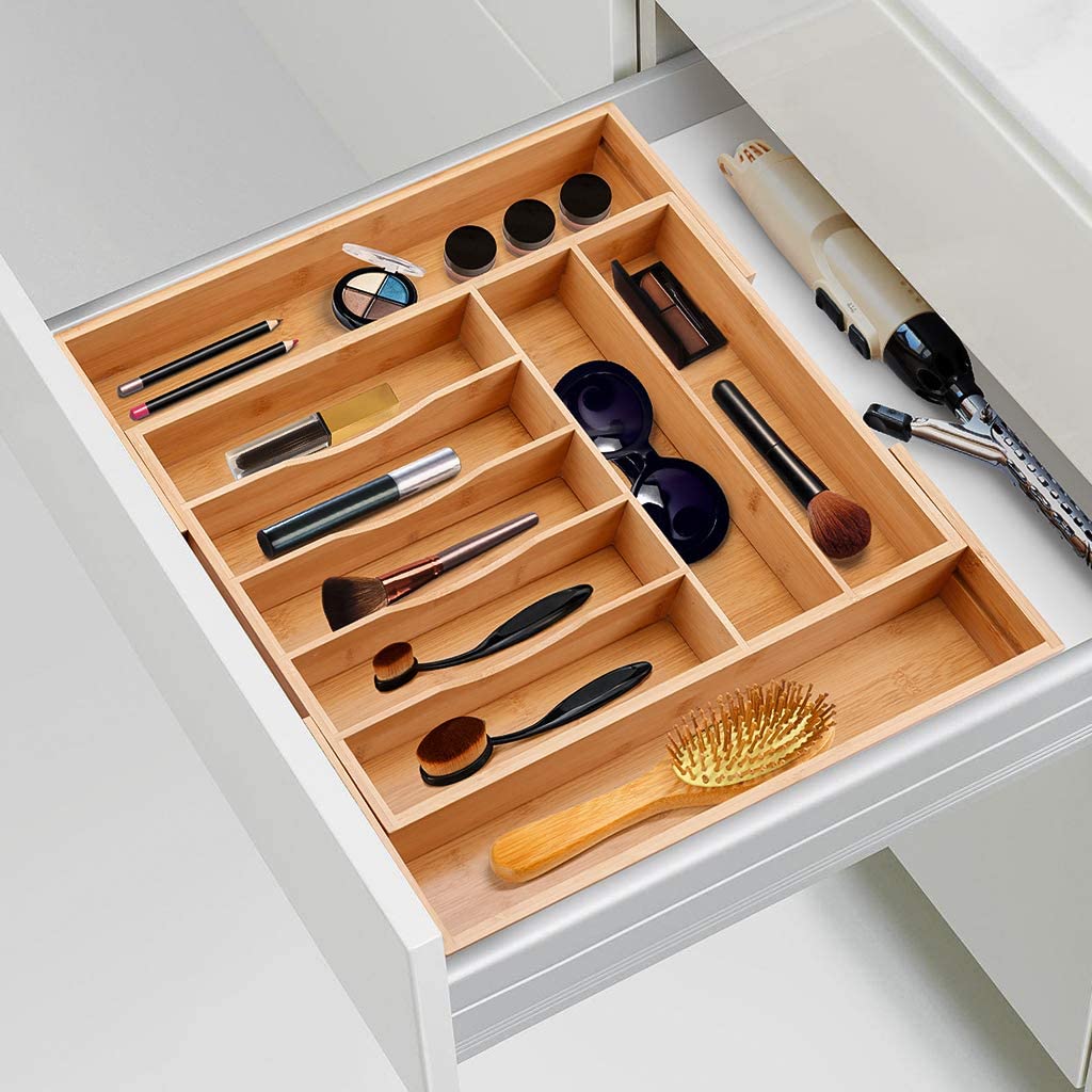
Here’s an example of showing a product in action—two Amazon product photos for a drawer organizer:
For a prospect looking for a drawer organizer, these photos confirm that the product can produce the outcome they’re looking for.
You might think the function is obvious, but when the brain has options, obvious doesn’t cut it. You want to make sure they KNOW your product is capable.
Takeaway?
Show your product in action. It can be enough to reduce a prospect’s uncertainty and get them to buy from you.
Amazon Product Photo Value Booster #2 – Compared To What?
Okay, so your product has features that make achieving your prospect’s goal easier, faster, and with fewer hiccups. That’s great.
Now, take those facts and make it visual.
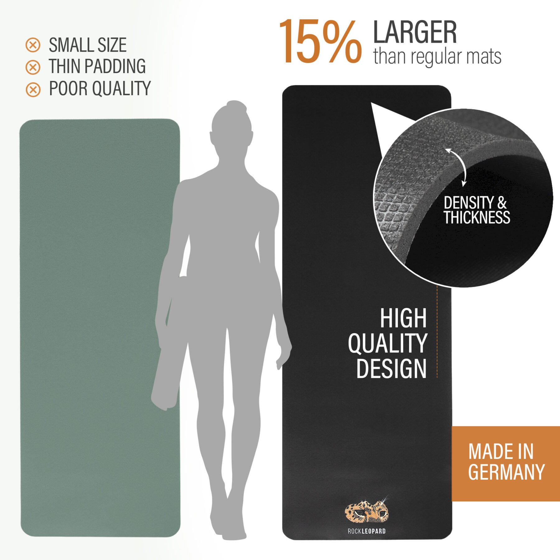
A great way to do that is by creating an infographic or chart that tracks the benefits of your product and then puts those benefits up against other products.
Those other products can be your direct competitors. And this can be important because there are likely hundreds of listings for products similar to yours. So, why should a prospect choose your product over the other ones?
Or those other products can be alternative solutions. So, not exactly your product, but another product a customer might use to solve the same problem. For example, a manual mop compared to a robot mop.
Or instead of comparing your product to other products, you can compare using your product to trying to solve the problem without any product at all.
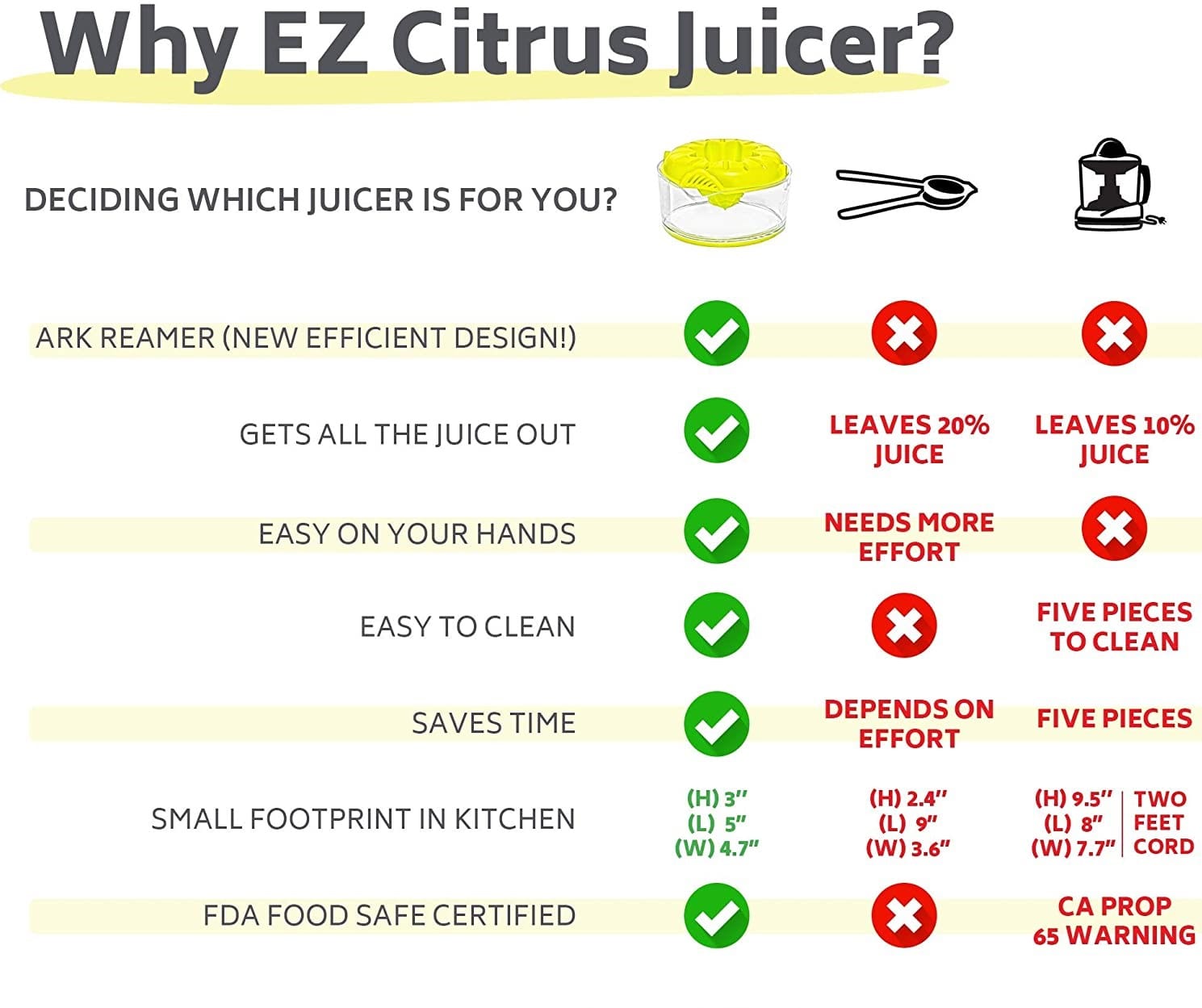
Here’s an example of an Amazon product photo that uses comparison to increase perceived value:
The three products that this photo compares serve the same function: juicing citrus.
But this seller highlights the features and benefits of their product, and shows how it functions smoother than alternative products.
Your prospect will likely make comparisons on their own. So, get ahead of them by guiding them through the process with a photo that does it for them.
Amazon Product Photo Value Booster #3 – Flaunt The Bells & Whistles
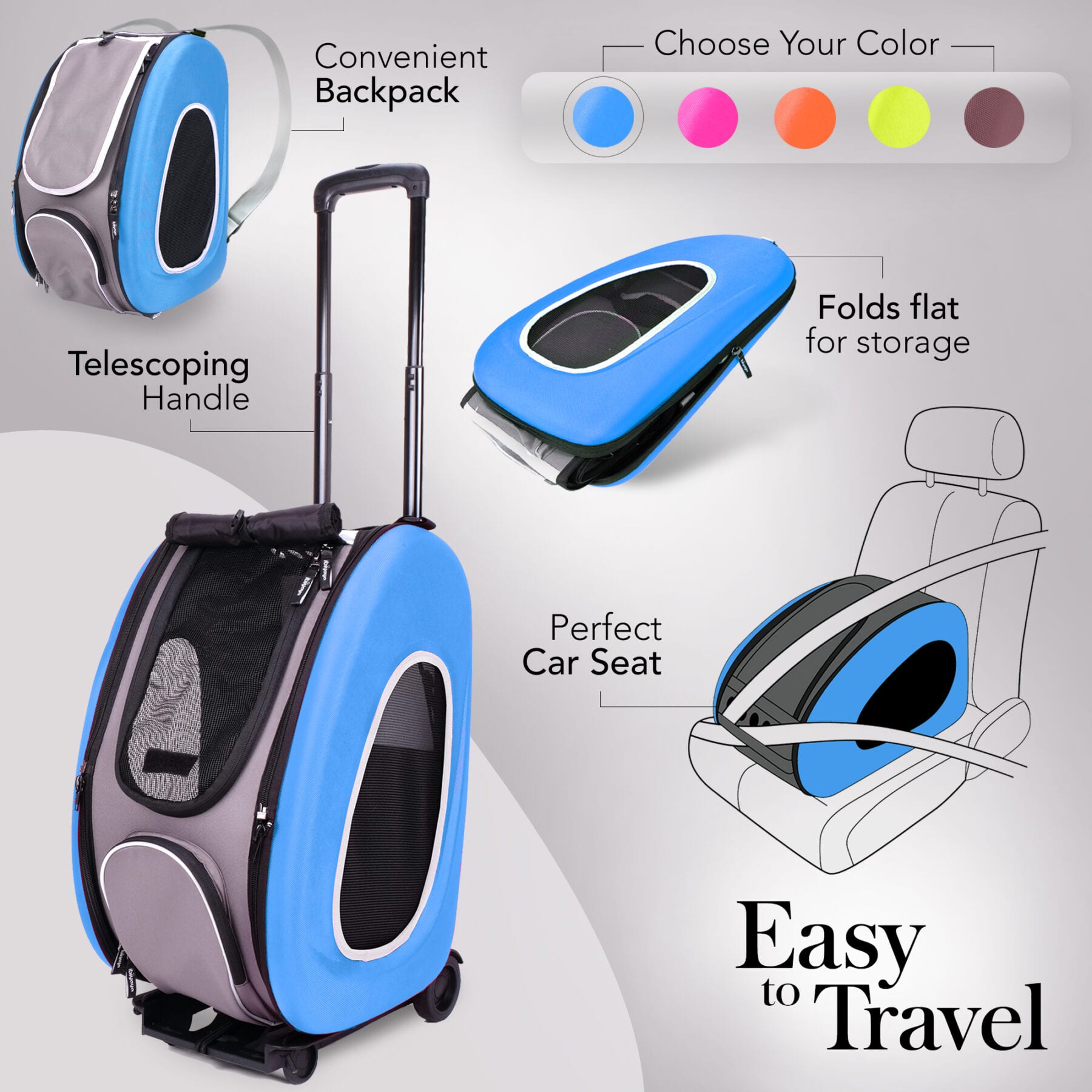
It doesn’t matter if your product is super simple or extremely flamboyant, you want to make sure your prospect understands the benefits that each feature provides.
That’s why we say, “Flaunt the bells & whistles.”
Your prospect will see your product image, but as the old saying goes, “Seeing and understanding are two different things.”
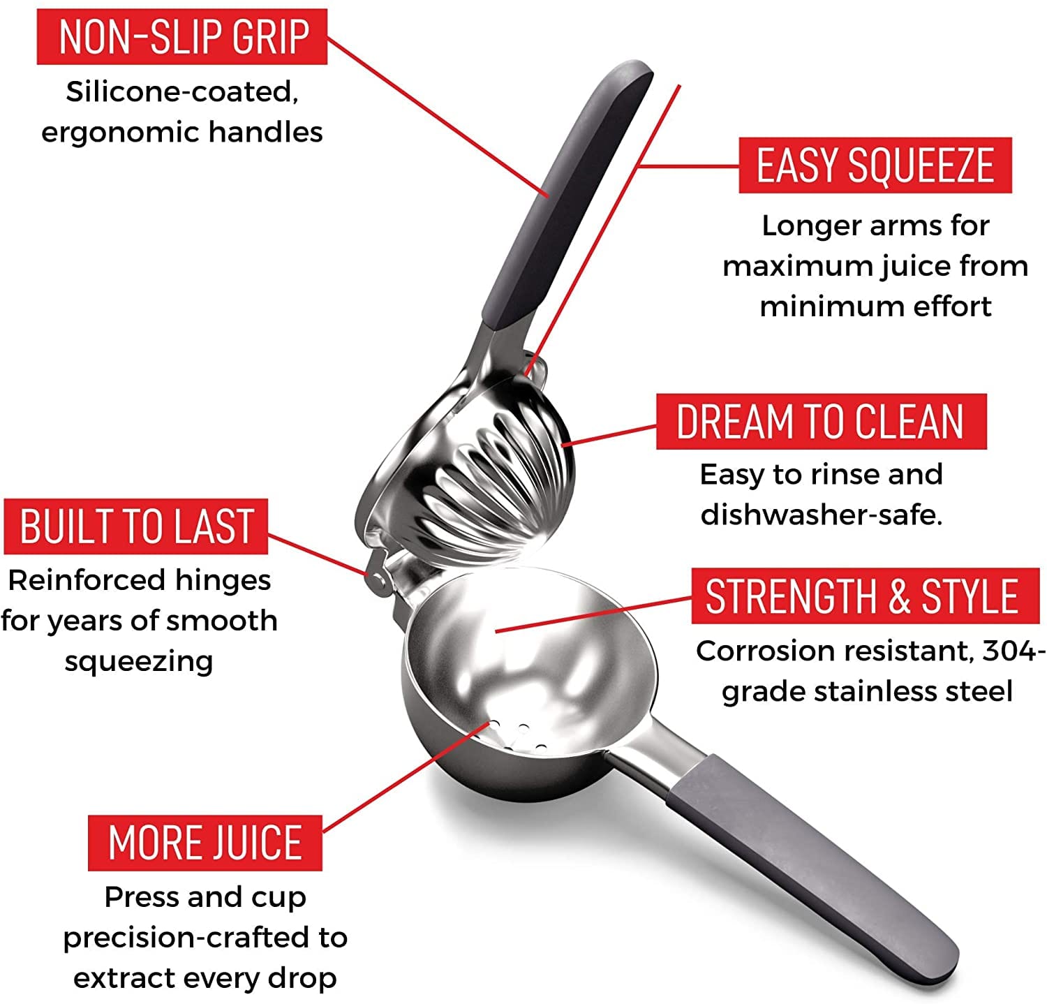
Here’s an example of an Amazon product photo that properly flaunts the bells & whistles:
This seller didn’t leave the product features to the prospect’s imagination. They took a rather mundane product (a handheld citrus juicer) and spiced it up.
Look at the label that says “Dream to Clean”. It doesn’t even describe a visual aspect of the product, but still, it’s calling out an important feature that customers look for when searching for a product like this.
Currently, this product listing has an Amazon’s Choice badge. While this photo likely isn’t the main factor that’s causing this product to sell, it definitely helps.
Amazon Product Photo Value Booster #4 – Close the Case
Customer voice: So, your product has some cool features, but so does this other listing over here. Why should I choose you?
Now, for this last Amazon product photo value booster…
This is where you really close the case for your product.
What’s that one feature of your product that makes it achieve your customer’s goal better than most of your competitors?
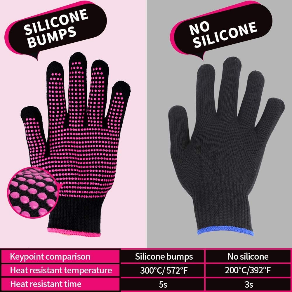
Whatever that feature is, highlight it in at least one of your Amazon product photos. Here’s an example from an Amazon listing for heat-resistant gloves:
When a prospect is looking for heat-resistant gloves, they might end up on this listing and say to themselves, “Well yeah, that’s a heat resistant glove, but it’s probably no different than the rest.”
And that’s where this photo comes in. It shows the prospect that this seller’s product is, in fact, different.
The image highlights that due to a single feature (silicone bumps), the product can do its job (resisting heat) at high temperatures, and for longer, than the average competitor.
Whatever feature your product has that makes it work better than your competitors… Shine a light on it and close the case.
Wrapping Up
Selecting your Amazon product photos can feel a bit daunting. But hopefully, with the four value boosters we laid out in this article, you feel equipped to direct your product photographers to produce photos that truly sell your product.
Remember, you can have up to six photos (excluding your main photo) to be creative and position yourself well. Make sure each photo has one goal—that way your prospect clearly knows the value that your product has to offer.
Happy Selling,
The Page.One Team
The Last Word:
Remember to research your competitors. See what their customers are complaining about in reviews. If you can use your images to contrast those complaints in a way that positions your product as having more capability, longevity, etc., then you have a head start to making sales once your listing has some visibility in Amazon’s search engine.

