Amazon Listing Optimization: 3 Product Page Qualities That Increase Conversions
When you sell on Amazon, your product page is the main real estate you have on the platform. That’s where customers learn about your product and decide to purchase.
There are ways to gain more real estate through avenues like pay-per-click advertising, live streaming, lightning deals, and more, but still, all those sources point back to your product page.
With the product page being so important, you want to be deliberate and strategic about how you use it. A product page on Amazon is not the same as the product page on your average eCommerce store.
In today’s article, we’re going to cover three qualities you must have on your Amazon product page if you want to convert the most visitors.
Quality #1 – Clarity
Quality number one seems like it should be obvious, yet many Amazon sellers completely fumble this when creating their product listings.
When competing products are only a click away, you can’t afford to be vague or ambiguous about your product and its benefits. Additionally, a lack of clarity on your listing can lead to negative reviews and ratings on your product page and seller profile.
Think of clarity as a shortcut.
The more clear you can be about your product features, benefits, and comparisons to alternatives, the easier it’ll be to speak to the various segments of your target audience.
For example, by providing specific dimensions for your product, you can speak to shoppers who live in an apartment, where space matters more.
In another instance, by highlighting how a product is shatter-resistant, you may speak to parents with young kids, who often have to put precautions in place to prevent harmful accidents.
The greater clarity you provide, the more shoppers will see the value that your product will have in their life, and the more you’ll attract high-quality customers with whom you can develop a long-term relationship.
In contrast, when you’re unclear, you can easily attract customers that don’t fit your ideal customer avatar—which works for short-term returns, but not long-term sustainability.
Here are a few prompts to help you provide greater clarity on your listing:
-
What comes in your product packaging?
-
How do you use the product?
-
What are the dimensions of the product?
-
What can the product do?
-
What problem does the product solve?
-
How is the product better than alternatives? (Alternatives are different solutions to the same problem; for example, threaded floss versus a water flosser)
-
How is the product better than direct competitors? (Direct competitors are people who sell a variation of the same product you sell; for example, Nikes running shoes versus Adidas running shoes.)
Quality #2 – Visual Confirmation
Studies show that most people are visual learners. That’s why one of the most important qualities you can infuse into your Amazon product listing is visual confirmation.
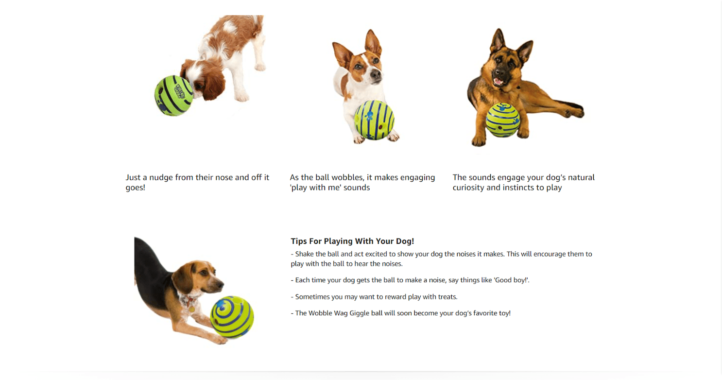
Visual confirmation is about putting a visual to the features and benefits you claim. Another way of thinking about this is a demonstration. “Demonstrate. Don’t proclamate.”
People tend to believe what they see with their eyes. In your copy, you may detail all your product features and benefits, but the shopper may not know what you’re referring to or understand the implication.
For example, if you said your product is heavy-duty, that’s such a vague term that people can interpret it in all sorts of ways. When you show your product being used outdoors in rugged weather or terrains, it helps add more context to the label “heavy-duty.”
When it comes to visuals, you have your standard listing product photos and videos, but Amazon offers you all sorts of ways to provide visuals on your listing through A+ Content.
Here are some visual ideas you might consider adding to your listing:
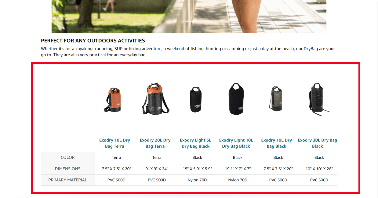
Product comparison chart – You can compare your product to an alternative, a competitor, or one of your other products. Standard comparisons include quality, features, size, and longevity.
Lifestyle photos – These are photos of people actively using the product and/or receiving the benefits. For example, if you sell a waterproof headset, you might have an image of someone wearing the headset and running in the rain.
Before and after photos – People purchase products to create a transformation. If you highlight that transformation on your product listing, you help the shopper envision themselves using it, which increases buy-in.
Quality #3 – Defined Features
Quality three is easy to overlook. You may sell a product with impressive features and figure “they speak for themselves,” but that’s just not how the average brain works.
When a shopper is browsing, they have multiple things to consider. They may be thinking about how much they want to spend, when the product will arrive, etc. They may be able to guess the benefit of a feature, but leaving them to guess can work against you.
Sometimes a shopper will figure that your mid-to-high price point is because of a unique feature your product has. They may figure they don’t need any upgrades or improvements and decide not to purchase from you because they just want the standard item and don’t see the value in the feature.
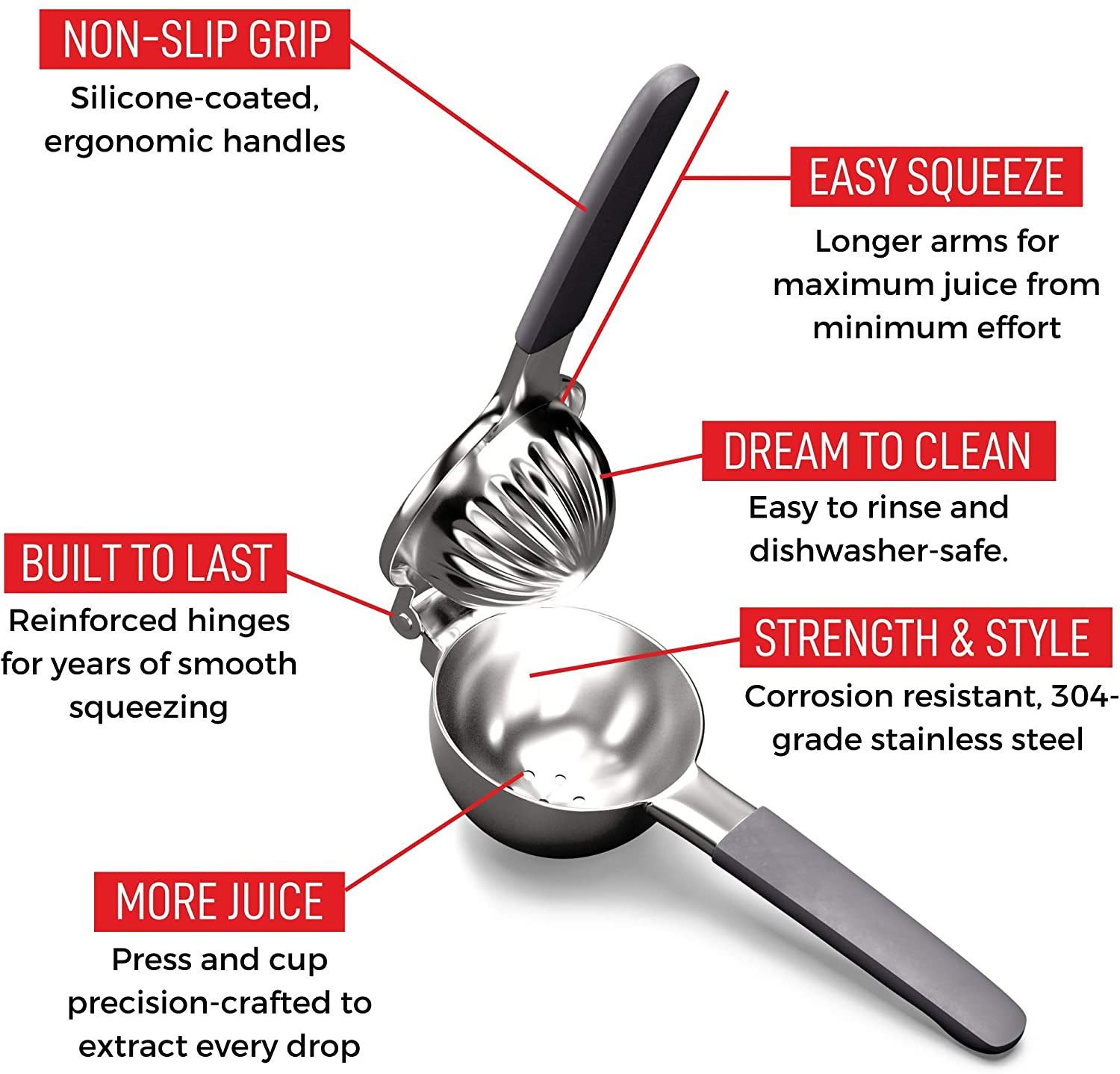
If you define that feature by explaining the benefits that come along, now you’re presenting an argument that makes the shopper interested versus just thinking your product is interesting. While this quality is so important, many listings get it wrong by overly focusing on features.
Here are some questions to ask yourself to help you better define your product features:
-
How does this feature affect how long does it take to reach the solution?
-
How does this feature affect the effort it takes to reach the solution?
-
Are there any features of competing products that make solving the problem harder?
-
Contrast is one of the greatest principles you can use in your marketing because it’s easy to understand. If products that are similar to yours have a feature that’s not effective or makes problems worse, highlight that on your listing.
-
Is the feature replaceable or customizable?
-
For example, a seller may have a padded sleeve around their coffee mug product to prevent users from burning their hand, but that sleeve may wear down with time, making the feature less appealing to some shoppers.
-
Or, maybe the shopper wants to swap the sleeve out for style. If you can remind them that the feature is replaceable or customizable, that can be enough to sell them on your product.
Wrapping Up
When you’re selling on Amazon, the same fundamental principles of sales and marketing apply but you have to consider the context.
Amazon is a marketplace full of different categories of products. On each product page, there are advertisements and product carousels that try to steal shoppers’ attention. As a seller, it’s your job to keep their attention. Engineering the three qualities discussed in this article into your product listing is a great way to not only keep attention but to convert more of the right customers.
Happy Selling,
The Page.One Team
The Last Word:
The good news is, many brands and sellers on Amazon don’t fully understand that they need to take into context the nature of the platform when creating their product listing. Thinking about your marketing and advertising as it is native to the Amazon platform works out to be a competitive advantage. You’ll get to satisfy customers better and capture a more loyal following.


